In 1947, famed architect Mies van der Rohe used the phrase “less is more” to explain minimalism.
‘Less is more’ is a familiar refrain recently – but it’s not a new idea. Historians trace minimalism’s roots to over 2500 years ago. Modern minimalism, as exemplified by the Bauhaus, Russian Constructivism and the De Stijl movements, is thought to be inspired from the Zen philosophy of traditional Japanese design. Many academics also agree that minimalism was a response to the rise of industrialization and dense urban living, creating for people a refuge from the hustle and bustle of major city life. Our love for minimalism waxed and waned throughout time.
But have we taken this a step too far? When is minimalism too minimal? And is beauty still worth investing in?
In this article, I’ll be sharing my thoughts about possible dangers in our approach to minimalism. I should and will start this short article by clearly stating my bias: I love minimalism! I love simple, effective design and I try to let it inspire my work and my team’s approach towards every project we work on at M7Alpha. So by no means is this some sort of attack towards the core ideas of minimalism; on the other hand this is a critique of how we may be misusing these ideas.
This article was partially inspired by a thread I found on Twitter. In this article, I elaborate on the arguments presented by Sheehan Quirke.
Detail is identity
Following the emergence of minimalism, old, frilly buildings made way for efficient sleek buildings made out of glass and steel. At the same time, populism and fun, detail and ornamentation have become almost synonymous with waste and inefficiency.
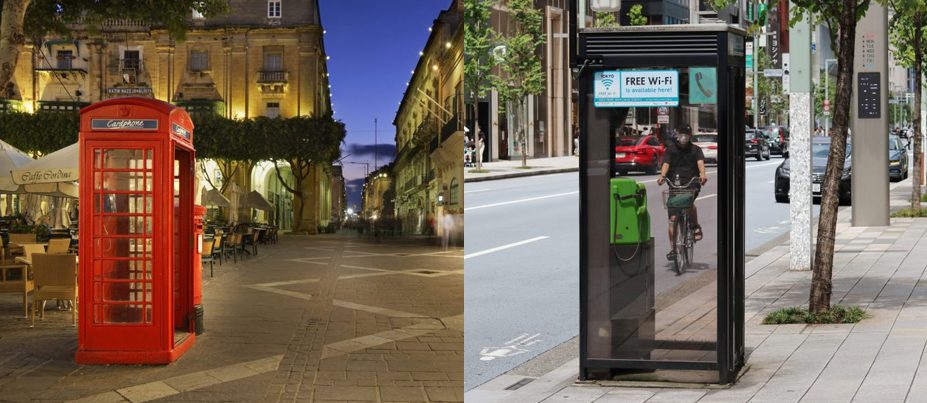
What gives the phone box in Valletta its distinctive character? The details: colour, mouldings around the door, the curves, the ornamentation at the top. The other phone box is minimal, has no real detail, and no character. What gives our traditional houses a distinctive character? The curves and fractals, the patterns, the ornamentation, and the manipulation and mixing of timber and iron. And here is the problem: Minimalism is a great point of departure, but if left alone, minimalism strips identity. We have to admit that the neutral colour palette and lack of funky details feels sterile.
So while plain aluminium front doors and glass balconies are cheaper to produce, there’s a reason we don’t put pictures of new apartment blocks on our postcards and adverts when we’re marketing Malta to foreigners. The peculiar woodwork and ironwork of our balconies and the doorknobs and plaques of the doors and the limestone carvings found in our churches and niches are not just an extravagance, they create identity.
The thing with detail (and, therefore, identity) is that we all have different tastes. When one adds detail, they’re infusing into the artefact their own personality, their own history, their own point of view and their own preferences. The artefact created, be it a balcony or a phone box or a product packaging or a brand logo, doesn’t just become a reflection of the person’s character, it also becomes a reflection of the community that person comes from. After all, a person’s character is shaped by the people they interact and the experience they’ve passed throughout their lives, and therefore it follows that so are the details they have a preference for.
We are hard-wired to appreciate beauty and detail. At the same time while it is very hard to define what makes something beautiful, we still seem to know beauty when we see it. Ideals shift and sometimes invert, but beyond tastes and trends, some elements have stood the test of time: symmetry, fractals and the golden ratio can be found across art and architecture since the beginning of our history. For example, a study by the department of neuroscience at the University of Oregon has shown that by the age of 3 children, like adults, prefer seeing fractal (geometric) patterns over straight lines. Beauty generates within us a pleasant feeling, and our longing for it has been with us since the earliest chapters of our history.
Minimalism and cost-reduction are compatible, but not identical
Is minimalism as a conscious design movement exclusively to blame for the elimination of detail and ornamentation? NO.
Cost-minimisation and minimalism may hold hands, but they’re not the same. Modernism on the cheap is just depressing (see the concrete blocks in Malta and compare them to your Google search of modernist houses built in the UK in the 1960s). And good minimalist design isn’t cheap. Sleek built-in cupboards cost a lot. And smooth, unadorned surfaces show every speck of dirt, requiring a level of maintenance many can’t afford. Carefully chosen angles, materials, and lighting are used to create the highest visual impact with the least amount of items.
People have been opting for the cheapest possible designs but it isn‘t just modern minimalism’s fault. The mass taxation of labour, as well as the short-termism caused by the pressure to maximise profit, are primary factors behind why balanced minimalism has been damaged by oversimplification. These factors have simultaneously incentivised mechanisation and mass production and made craftsmanship in architecture and design an investment only feasible for those who can afford to take the risk of investing in beauty for the sake of beauty.
Unlike our ancestors, we live today in almost completely man-made environments and in the process of prioritising cost-efficiency and functionality, we have neglected beauty, detail and identity. We created environments filled with one bland standardised box against the next.
A million-dollar question then follows.. When should we go minimal? and when should we opt for richer detail?
Balance, as in everything, is key. When a space – whether that’s city or a home or creative advert – strikes a balance between minimalism and detail, the results can be exceptional. Adding detail to minimalism doesn’t have to mean exuberant use of ornamentation, it can simply mean striking a balance between efficiency and purposeful detail, it can simply mean adding limestone cladding, curves, mixing materials and careful use of colour in a brand book or a remarkable type in a logo.
Beauty encourages preservation
Would you like a furniture piece to be preserved? Make it beautiful. The emotions and ideas inspired by detail lead us to not only admire but to also maintain and preserve. In other words, when we become attached to something, we fight for its survival.
In Antifragile: Things That Gain from Disorder, Nassim Taleb presented the Lindy Effect. Simply put: Things that have been around for a long time do not “age” like persons, but “aging” in reverse. In architecture, and elsewhere, age is an indicator of robustness. Basically, the longer something has been around, the longer it will persist. In the short-run, absolute minimalism is cost-efficient, but it’s not robust because, without detail, there’s very little that inspires preservation. Within days of the fire at the 800-year-old cathedral of Notre-Dame de Paris in 2019, the watching world had pledged over a billion euros to fund its reconstruction.
And it is for this reason that investment in details, and finding the the right balance between simplicity and character, whether in the form of masonry or ironwork in buildings, beautiful typography in brand identities or beautiful geometric layouts in web design, is worth our time and money. And so is beauty for the sake of beauty.